I know what it’s like to stand in your living room and feel stuck.
You see beautiful homes everywhere online but can’t figure out how to make yours look that way. You buy things that seem right in the store but feel wrong once you get them home.
Here’s the truth: decorating isn’t about following trends or buying expensive pieces. It’s about understanding a few core principles that professionals use every day.
I’ve spent years helping people create homes they actually love. Not showroom perfect spaces. Real homes where you want to spend time.
This article gives you a framework for decoration tips decoradhouse from decoratoradvice. The same approach I use when working with clients who feel overwhelmed by choices.
You’ll learn how to make design decisions with confidence. How to create a space that feels cohesive instead of thrown together. And how to do it without second guessing every purchase.
We’re skipping the fluff and the trend chasing. Just practical steps that work in real homes with real budgets.
By the end, you’ll have a clear path forward. No more staring at paint swatches for hours or wondering if that couch will actually fit your space.
The Foundation: Mastering the 70/20/10 Decorating Rule
I’ll never forget the first time I tried to decorate my living room in Batavia.
I painted the walls a deep teal because I loved it. Then I bought a burnt orange sofa because that was on sale. Added some purple curtains because why not.
It looked like a circus threw up in my house.
That’s when I learned about the 70/20/10 rule. And honestly, it saved me from a lot of expensive mistakes.
Here’s how it works.
You pick three colors. Your main color takes up 70% of the room. That’s your walls and big furniture pieces. Your secondary color gets 20%, which means things like textiles and accent chairs. The last 10% is your pop of color in art and throw pillows.
Some designers say this rule is too rigid. They argue it kills creativity and makes every room look formulaic.
But I’ve found the opposite is true.
The rule gives you a framework so you don’t end up with my teal-orange-purple disaster. You can still be creative. You just have a roadmap that keeps you from going off the rails.
Let me show you what this looks like in real life.
Say you love gray. Make that your 70%. Paint your walls gray and choose a gray sectional. Then pick navy as your 20% for curtains and an accent chair. Finally, add mustard yellow as your 10% in throw pillows and a piece of wall art.
The room feels balanced. Not boring. Not chaotic.
For more guidance on creating cohesive spaces, check out decoration tips Decoradhouse for practical styling ideas.
This is your starting point for every room you touch.
Essential Design Element: Choosing Your Color Palette
I always tell people to start with something they love.
A rug. A painting. Even a throw pillow that makes you smile every time you see it.
That’s your inspiration piece. And it’s going to do the heavy lifting for your entire color palette.
Here’s why this works. When you pull colors from something you already love, you’re not guessing. You’re building on a foundation that already feels right to you.
But here’s where most people mess up.
They pick a beautiful inspiration piece with warm terracotta tones. Then they paint their walls a cool gray with blue undertones. And suddenly nothing looks quite right.
Undertones matter more than you think.
Warm undertones (think yellow, red, orange bases) create cozy spaces. Cool undertones (blue, green, purple bases) feel crisp and calm. Neutral undertones sit somewhere in between.
The mistake? Mixing warm and cool without knowing what you’re doing. Your beige sofa might have pink undertones while your gray walls lean green. They’ll fight each other every single day.
Paint samples vs. buying a gallon and hoping for the best.
I know it seems like extra work. But test your paint on different walls. Watch it in morning light. Check it again at sunset. What looks perfect at noon might look completely different at 7 PM when you’re actually home. When designing your gaming space, remember to take a cue from Decoradhouse and test your paint on different walls throughout the day, as what seems perfect in the afternoon light might transform entirely by evening. When designing your gaming space, remember to take a cue from Decoradhouse and carefully consider how different lighting throughout the day can dramatically alter the appearance of your chosen colors and decor.
(I learned this the hard way with a “warm white” that turned into cold hospital walls once the sun went down.)
And remember, your color palette doesn’t stop at the walls. Your furniture picks up 70% of your main color. Textiles and secondary pieces take 20%. Accent decor gets the final 10%.
You can find more decoration tips at decoradhouse to help you nail this balance.
Inspiration piece with warm terracotta vs. inspiration piece with cool navy.
See the difference? One pulls you toward creams, rust, and golden wood tones. The other wants whites, grays, and maybe some brass accents.
Neither is wrong. But mixing them? That’s where things get messy.
Interior Styling Ideas: Layering Lighting and Texture

You walk into a room and something feels off.
The furniture is fine. The colors work. But it still feels flat.
I see this all the time. People think good design is about picking the right couch or paint color. But what really makes a space feel complete? It’s how you layer light and texture.
Let me break this down.
The Three Layers of Lighting Decoradhouse Renovation Tips From Decoratoradvice picks up right where this leaves off.
Most people just flip on the overhead light and call it done. But that’s why rooms feel harsh or boring.
Professional designers use three types of lighting. And once you understand them, you’ll see them everywhere.
Ambient lighting is your base layer. Think ceiling fixtures or recessed lights. It fills the whole room with general illumination so you can see where you’re going.
Task lighting goes where you actually do things. Reading lamps next to your chair. Under-cabinet lights in the kitchen. Desk lamps in your home office.
Accent lighting is what makes a room interesting. Picture lights that highlight your art. LED strips behind your TV. Small spotlights that draw attention to a plant or sculpture.
You need all three. Just one or two? Your room will feel incomplete.
Why Texture Matters
Here’s what nobody tells you about texture.
A room with only smooth surfaces feels cold. Like a doctor’s office or a hotel lobby. You can’t quite put your finger on why, but you don’t want to stay there long.
Texture adds warmth and depth. It gives your eye something to land on. It makes a space feel lived in (in a good way).
How to Add Texture
Start simple. You don’t need to renovate.
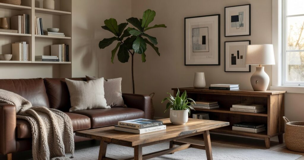
Throw a chunky knit blanket over your couch. Swap out those flat pillows for velvet or linen ones. Add a woven basket in the corner for blankets or magazines.
A jute rug under your coffee table changes everything. So does a wooden side table with visible grain instead of that glossy laminate one.
And plants. Live plants add texture you can’t fake.
Mix smooth with rough. Soft with hard. Matte with a little shine.
That’s when a room starts to feel right. For more ways to refresh your space inside and out, check out these home exterior hacks decoradhouse.
The best part? You probably already own half of what you need. You just need to layer it better.
Space Optimization: Furniture Layout and Flow
Most people think decorating is about buying pretty things.
It’s not.
It’s about making a room work. And honestly, I see the same mistakes over and over.
You walk into someone’s home and you’re dodging furniture like it’s an obstacle course. Or everyone’s staring at the TV because that’s the only way the seating makes sense. (Even when you’re trying to have an actual conversation.) To create a more inviting space that encourages conversation rather than turning every gathering into a game of dodge-the-furniture, consider implementing some innovative Decoradhouse Lumination Ideas that can transform the atmosphere of your home. To transform a chaotic living room into a welcoming gathering place, consider implementing some innovative Decoradhouse Lumination Ideas that not only enhance the atmosphere but also facilitate meaningful conversations among guests.
Here’s my take.
Every room needs a focal point. A fireplace. A big window with a view. Maybe a piece of art that makes you stop and look.
Whatever it is, your furniture should honor it. Not fight against it.
I arrange seating to face each other first. The TV can wait. Because when people come over, I want them talking to each other, not craning their necks or shouting across the room.
Some designers will tell you the TV should be the center of everything. That every chair should have a perfect view of the screen.
I disagree.
Your living room isn’t a movie theater. It’s a space for living. And that means actual human interaction.
Now let’s talk about traffic flow.
You need about 3 feet for major walkways. Not 18 inches where people are turning sideways to squeeze through. THREE feet.
If guests are doing that awkward shuffle past your coffee table, your layout is wrong.
And rugs. Oh, the rugs.
This is where most people mess up completely. They buy these tiny rugs that look like decorative bath mats floating in the middle of the room.
A rug should be large enough for at least the front legs of ALL your main furniture to rest on it. Not just touching it. ON it.
When you get this right, the whole room pulls together. When you don’t, everything looks disconnected and awkward.
For more tips on getting your space right, check out decoratoradvice.
Look, I’m not saying you need to follow every design rule out there.
But these basics? They matter.
Practical Makeover Tip: Avoid These Common Decorating Mistakes
I walk into homes all the time where something just feels off.
The owners spent money. They tried hard. But the space still doesn’t work.
Here’s what I’ve learned after years of fixing these rooms. Most decorating problems come down to four mistakes that almost everyone makes.
Mistake #1: Hanging Art Too High
Your art should sit at eye level. That means the center of the piece needs to be about 57 to 60 inches from the floor.
Why? Museums use this standard because it’s where our eyes naturally land (the National Gallery of Art follows this rule religiously). When you hang art higher, people have to crane their necks. It breaks the flow of the room.
Mistake #2: Pushing All Furniture Against the Walls
I get it. You want to maximize space. But shoving everything against the walls actually makes rooms feel BIGGER and emptier in a bad way.
Pull your furniture away from the walls. Even just a few inches creates breathing room and makes the space feel intentional. Interior designers call this “floating” furniture, and studies show it makes rooms feel 30% more inviting.
Mistake #3: Ignoring Scale
A tiny sofa in a large living room looks lost. An oversized sectional in a small den feels suffocating.
Balance matters. Your furniture should fit the room’s proportions. If you’re working with Decoradhouse lumination ideas, pay attention to how light fixtures relate to table sizes too.
Mistake #4: Forgetting Personality
Don’t just copy a catalog spread.
The best decoration tips decoradhouse from decoratoradvice all say the same thing. Spaces need YOU in them. That vintage clock from your grandmother. The weird art you picked up on vacation. These pieces make a house feel like home. To truly personalize your living space, don’t overlook the importance of outdoor aesthetics, and for that, check out the inspiring Home Exterior Hacks Decoradhouse that can transform your yard into a welcoming extension of your home. To truly personalize your living space, consider incorporating some Home Exterior Hacks Decoradhouse that reflect your unique style and turn your house into a vibrant home.
Without them, you’re living in a showroom.
Decorate with Confidence and Purpose
You came here feeling stuck about how to pull your space together.
I get it. Decorating can feel overwhelming when you’re staring at blank walls and empty corners.
But now you have the rules that actually work. The 70/20/10 color split. Layering textures. Furniture placement that makes sense.
These aren’t just tips I pulled from thin air. They’re the principles that turn a room from confused to cohesive.
You don’t need to tackle your entire house at once (that’s a recipe for burnout). Pick one room. Find your inspiration piece. Build your color palette around it.
Then start placing furniture and adding layers.
The difference between a space that feels off and one that feels right often comes down to following these basics. When you apply them, your rooms start looking like you hired a professional.
decoradhouse gives you the framework. You bring the vision.
Start today with that one room you’ve been avoiding. Choose your anchor piece and let everything else fall into place from there.
 Trevella Veythanna is the kind of writer who genuinely cannot publish something without checking it twice. Maybe three times. They came to interior styling ideas through years of hands-on work rather than theory, which means the things they writes about — Interior Styling Ideas, Decorad Space Optimization Techniques, Curious Insights, among other areas — are things they has actually tested, questioned, and revised opinions on more than once.
That shows in the work. Trevella's pieces tend to go a level deeper than most. Not in a way that becomes unreadable, but in a way that makes you realize you'd been missing something important. They has a habit of finding the detail that everybody else glosses over and making it the center of the story — which sounds simple, but takes a rare combination of curiosity and patience to pull off consistently. The writing never feels rushed. It feels like someone who sat with the subject long enough to actually understand it.
Outside of specific topics, what Trevella cares about most is whether the reader walks away with something useful. Not impressed. Not entertained. Useful. That's a harder bar to clear than it sounds, and they clears it more often than not — which is why readers tend to remember Trevella's articles long after they've forgotten the headline.
Trevella Veythanna is the kind of writer who genuinely cannot publish something without checking it twice. Maybe three times. They came to interior styling ideas through years of hands-on work rather than theory, which means the things they writes about — Interior Styling Ideas, Decorad Space Optimization Techniques, Curious Insights, among other areas — are things they has actually tested, questioned, and revised opinions on more than once.
That shows in the work. Trevella's pieces tend to go a level deeper than most. Not in a way that becomes unreadable, but in a way that makes you realize you'd been missing something important. They has a habit of finding the detail that everybody else glosses over and making it the center of the story — which sounds simple, but takes a rare combination of curiosity and patience to pull off consistently. The writing never feels rushed. It feels like someone who sat with the subject long enough to actually understand it.
Outside of specific topics, what Trevella cares about most is whether the reader walks away with something useful. Not impressed. Not entertained. Useful. That's a harder bar to clear than it sounds, and they clears it more often than not — which is why readers tend to remember Trevella's articles long after they've forgotten the headline.