

Caught in the dilemma of adoring the bold charm of retro design but also yearning for the serene elegance of contemporary spaces? You’re not alone. It’s a common struggle, trying to fuse the styles without ending up with a room that looks more like a jumbled time capsule than a polished home.
Yet, it doesn’t have to be this way.
I’ve spent years diving into successful interior design projects, understanding the core principles that make these combinations work. And trust me, creating that perfect balance of color, form, and texture is more achievable than you might think.
This article provides a straightforward guide to blending these distinct styles harmoniously. By the end, you’ll have the confidence to execute your own vintage modern mix ideas, making your space unique and timeless.
Retro vs. Contemporary: Clash or Harmony?
Retro in interior design is all about the past. Think Mid-Century Modern (the 50s and 60s) with its organic shapes and teak wood. Or the 70s, where lively oranges, greens, and mustards ruled.
Geometric patterns were everywhere. It’s nostalgic, yet bold. But is it practical today?
Now, contemporary design is about the present. It’s clean lines and neutral colors. Beiges, grays, whites.
Spaces are uncluttered, focusing on form and space. Natural materials like light woods and stone dominate. It’s simplicity at its core but can feel cold if overdone.
Can these styles coexist? Absolutely. Both appreciate simple forms and can feature statement lighting.
This is where the magic happens. Think of retro’s warmth balancing contemporary’s sterility. It’s about letting one style’s strengths compensate for the other’s weaknesses.
You see, the trick is not forcing them together but finding harmony.
Want a few vintage modern mix ideas? Start with a retro couch in a contemporary room. Or add geometric patterns to a neutral space.
Let the bold colors of retro pieces pop against contemporary backdrops. The effect can be stunning.
Pro tip: Don’t overdo it. A single retro piece can transform a space without overwhelming it. Interested in more ways to achieve this balance?
Check out this minimalist interiors less more approach for inspiration. It’s a great resource for those looking to blend styles effectively.
So, does combining these styles work? Definitely. It’s all about balance and knowing when to stop.
The 80/20 Rule: Design without Disarray
Let’s talk about the 80/20 Rule of Style Blending. It’s simple but genius. You take 80% of one style and blend it with 20% of another.
Why? Because balance is everything. This approach stops one style from overtaking your space like a bad plot twist.
In Scenario A, the contemporary foundation takes the lead. Picture this: a room with a neutral sofa, minimalist media console, and light walls. It’s cool, calm, collected.
But then, you add a starburst clock or an armchair with tapered legs. Maybe throw in some bold, patterned cushions. Suddenly, you’re not just another minimalist.
You’ve got flair, a little retro touch that says, “I know what I’m doing.”
Now, flip it. Scenario B gives us the retro foundation. Imagine a room with a bold, geometric wallpaper or a vintage credenza.
It’s eye-catching, maybe a bit loud. But here’s the trick (balance) it with 20% contemporary. Think of a clean-lined sofa, sleek metal floor lamps, or minimalist decor.
The modern touches don’t just tone it down; they raise it.
This rule isn’t just a design hack. It’s a mindset. It keeps things intentional, not chaotic.
You’re not just throwing styles together; you’re curating them. For more on how to achieve this balance, check out this overview. It’s important for anyone chasing that perfect vintage modern mix.
So, why let one style steal the show? With the 80/20 rule, you’re the director, not just a spectator.
Room-by-Room Inspiration: Putting Theory into Practice
to some vintage modern mix ideas for every room. You know what I’m talking about: mixing the old with the new, creating spaces that feel both contemporary and timeless. It’s not just about aesthetics; it’s about creating a vibe that feels right.
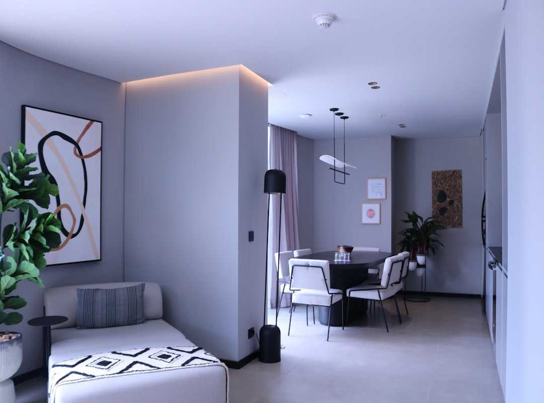
The Living Room
Picture this: a sleek, low-profile contemporary sofa as your room’s anchor. It’s the perfect backdrop for a kidney-shaped coffee table. Add an arc floor lamp and a high-pile shag rug in a muted tone.
The retro elements give character, while the contemporary pieces keep it fresh. That’s the magic of a good mix.
The Kitchen
Modern kitchens are all about clean lines. Think flat-panel cabinets and stainless steel appliances. But why stop there?
Inject some retro flair with a colorful backsplash of geometric tiles. Maybe throw in vintage-style bar stools or a single, iconic appliance like a Smeg refrigerator. It’s like stepping into the future while nodding to the past.
The Bedroom
Start with a minimalist, contemporary upholstered bed frame. Neutral linens set a calm tone. Now, to spice things up, add walnut nightstands.
Ceramic table lamps with drum shades bring in that retro touch. Top it off with a piece of abstract art featuring a 70s-inspired color palette. It’s a space where you can truly unwind.
The Home Office
Your workspace should be a haven of productivity. A simple, contemporary desk and ergonomic chair are your essentials. But don’t forget the vintage-style task lamp.
Bold-colored file organizers add a pop of personality. And if you’ve got space, an Eames-style lounge chair in the corner is perfect for reading breaks.
Incorporating these elements isn’t just about looks. It’s about creating a space that feels lived in and loved. If you’re into the art deco revival glamour modern homes, you know it’s about more than just furniture.
It’s about history and style. Don’t just follow trends; set them. Your home should reflect you, not a catalog page.
So, what’s next for your space? Time to get inspired and make it your own.
Avoiding Common Mistakes: Design Pitfalls to Sidestep
Designing with a vintage modern mix can be tricky. You want that perfect balance, right? Let’s avoid the ‘Theme Park’ Effect.
You know what I mean: rooms that look like a retro costume set. It happens when you use too many iconic pieces from one era. Instead, pick one or two standout retro items.
Pair them with neutral, contemporary pieces. This keeps your space interesting, not overwhelming.
Another mistake? Ignoring scale and proportion. Imagine a bulky 70s sofa in a small, minimalist room.
It’s like squeezing an elephant into a Mini Cooper. Not ideal. Make sure those retro pieces fit the room’s scale.
They should complement, not dominate, the other furniture.
And let’s not forget about color. A unifying color palette is important. Without it, your room can look chaotic.
Choose 2-3 colors from your main retro piece. Use them throughout the room in textiles, art, and decor. This ties everything together, creating harmony.
Pro tip: Always step back and assess your space as a whole. Are your vintage modern mix ideas working? If not, tweak until it feels right.
Balance and cohesion are key.
Your Unique Space Awaits
Merging two beloved styles without chaos is tricky, right? But here’s the deal: a vintage modern mix ideas approach is your answer. The 80/20 rule is your secret weapon.
By deliberately balancing character and simplicity, you create a space that feels personal yet sophisticated. Start small. Find one perfect retro piece to slip into your contemporary room.
Watch how it transforms everything. Feel the change, embrace the history. Now, isn’t that what you wanted?
Stop hesitating. Make that change. Your unique, timeless space is just a decision away.
Go on, you know you want to.
 There is a specific skill involved in explaining something clearly — one that is completely separate from actually knowing the subject. Christophers Millerater has both. They has spent years working with home living highlights in a hands-on capacity, and an equal amount of time figuring out how to translate that experience into writing that people with different backgrounds can actually absorb and use.
Christophers tends to approach complex subjects — Home Living Highlights, Practical Home Makeover Tips, Interior Styling Ideas being good examples — by starting with what the reader already knows, then building outward from there rather than dropping them in the deep end. It sounds like a small thing. In practice it makes a significant difference in whether someone finishes the article or abandons it halfway through. They is also good at knowing when to stop — a surprisingly underrated skill. Some writers bury useful information under so many caveats and qualifications that the point disappears. Christophers knows where the point is and gets there without too many detours.
The practical effect of all this is that people who read Christophers's work tend to come away actually capable of doing something with it. Not just vaguely informed — actually capable. For a writer working in home living highlights, that is probably the best possible outcome, and it's the standard Christophers holds they's own work to.
There is a specific skill involved in explaining something clearly — one that is completely separate from actually knowing the subject. Christophers Millerater has both. They has spent years working with home living highlights in a hands-on capacity, and an equal amount of time figuring out how to translate that experience into writing that people with different backgrounds can actually absorb and use.
Christophers tends to approach complex subjects — Home Living Highlights, Practical Home Makeover Tips, Interior Styling Ideas being good examples — by starting with what the reader already knows, then building outward from there rather than dropping them in the deep end. It sounds like a small thing. In practice it makes a significant difference in whether someone finishes the article or abandons it halfway through. They is also good at knowing when to stop — a surprisingly underrated skill. Some writers bury useful information under so many caveats and qualifications that the point disappears. Christophers knows where the point is and gets there without too many detours.
The practical effect of all this is that people who read Christophers's work tend to come away actually capable of doing something with it. Not just vaguely informed — actually capable. For a writer working in home living highlights, that is probably the best possible outcome, and it's the standard Christophers holds they's own work to.